Week in Watches: Grand Seiko GMTs, the state of the Nautilus, and Swatch Jellyfish
Plus an in-depth look at Omega Speedmaster 'Racing' dials
A sunkist newsletter back from a week bumbling around Miami Beach. We cover releases from Swatch and Grand Seiko, Nautilus news, and an in-depth look at Omega Speedmaster ‘Racing’ dials.
RELEASES
Swatch Clear Collection, an homage to my favorite vintage Swatch
When I saw the latest Swatch release, I felt seen, as the TikTok generation says.
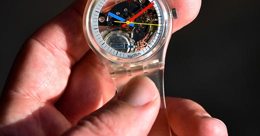
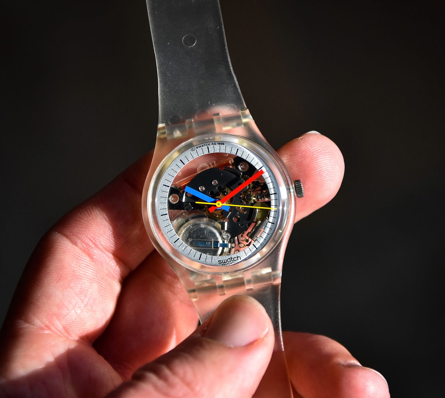
Like a lot of people, I’ve gone down the vintage Swatch deep end once or thrice. Last time I came to and swam to the surface gasping for air, I ended with an original Swatch Jellyfish in tow (ref. GK100). Released in 1983 — right around the time Swatch as a brand first launched — it’s one of those classic Swatch models. Apparently, the first Jellyfish run was actually the first Swatch limited edition.1 Swatch re-released the Jellyfish in the 90s with a plain black handset, but it’s just not the same as the original.
This time though, Swatch got it right, in so many ways.
Swatch has introduced the Clear Collection, an homage to the original Jellyfish. It’s a collection of four watches with clear cases and bands, designed to look pretty much exactly like the 80s Jellyfish.

Even better, Swatch has one model in the original Gent size, a cool 34mm. Sure, there’s also the Modern Gent (41mm) and the Big Bold (47mm), but to me a classic watch deserves a classic size. There’s also a Clearly Skin, the Jellyfish form packaged up in Swatch’s super-thin classic Skin form.
According to A Collected Man, Swatch produced only 200 examples of that original limited-edition Jellyfish run. In that ACM article John Goldberger himself also refers to Swatch as the “last great innovation in horology,” a sentiment from the great mechanical watch collector that I love.
I do think the vintage Jellyfish is somewhat “collectible”, as are many of Swatch’s artist collabs — as much as any battery-powered piece of plastic can be, I suppose. Not for any horological feat, but just because it’s a cool object of the 80s.
On most original examples, the clear case and band have aged to an absolutely disgusting yellow. It took me a good 6 months of searching and eBay notifications to find an NOS example with the original retailer tag still on it (a Marshall Field’s tag at that, catnip to a Chicagoan!).
Now though, you can snag a new Swatch Jellyfish with the click of a button. Check out the Swatch Clear Collection on swatch.com. The Gent version starts at $70.
On Grand Seiko GMTs
And the new SBGJ255 Hi-Beat GMT 44GS 55th Anniversary Limited Edition

Two weeks into Week in Watches, and we've already got inside jokes, dear reader. Another week, another Grand Seiko release. (Last week, it was the new White Birch.)
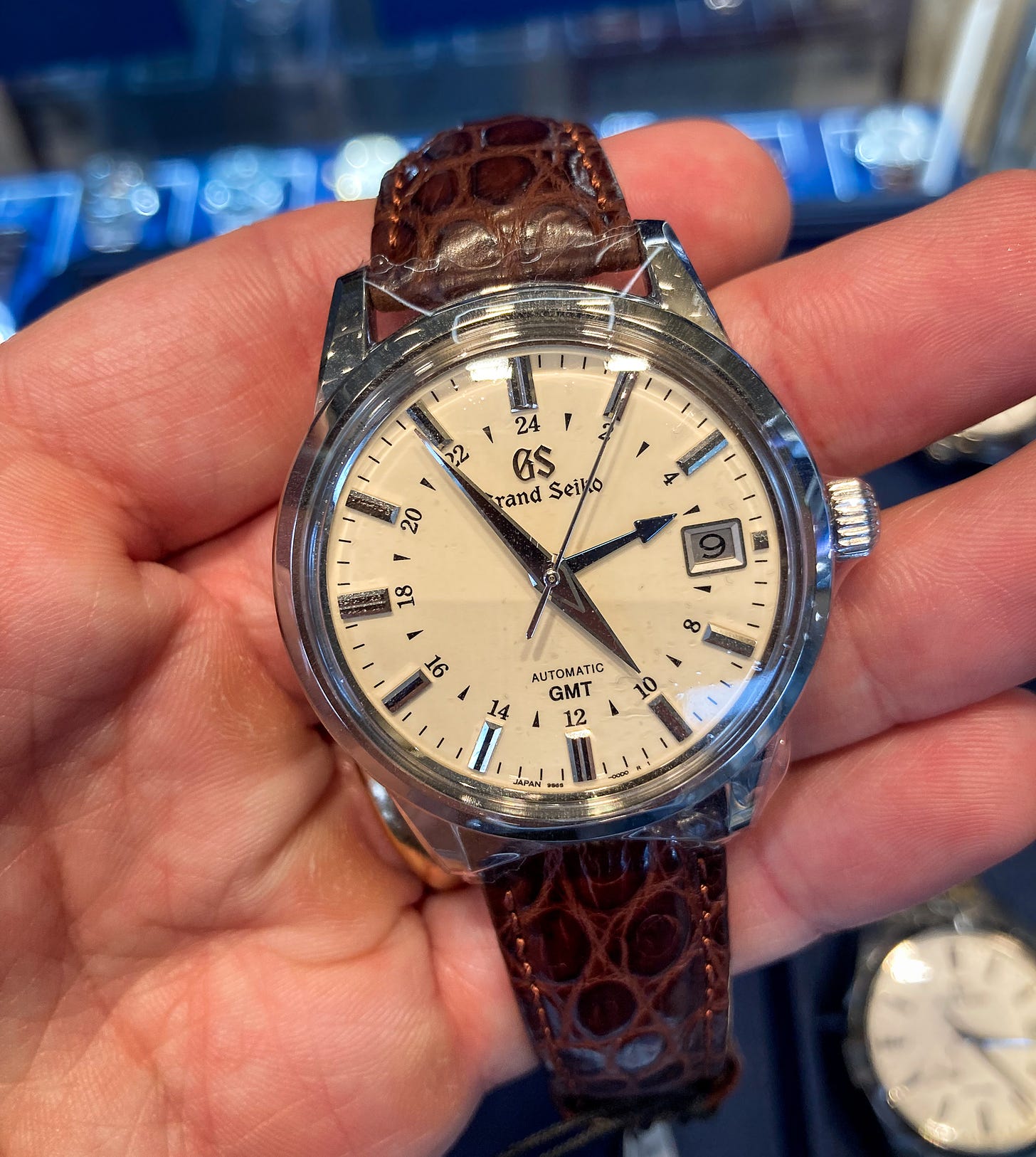
I was actually in Miami this week and visited the Grand Seiko boutique in the Design District. Weaving through the influencer photoshoots in the Lamborghini-laden neighborhood, I made my way to the boutique to try on the brand-new SBGJ255 Heritage Collection Mechanical Hi-Beat GMT 44GS 55th Anniversary Limited Edition. The above photo is a prototype with a non-functioning movement.
First, some specs:
Case: Titanium 40mm x 14mm
Movement: 9S86 Hi-Beat Caliber (36,0000 bpm)
Dial: Subtle vertical graining
Limited edition: 1,200 pieces
Price: $8,500
A case to be made. The titanium case shape is inspired by the original 44GS, created in 1967 and the first real “Grammar of Design” case from GS and designer Taro Tanaka. As much as I love the original 44GS case — which measures more like 36mm — I didn’t love the upsized 40mm version on my wrist. The wide and faceted lugs feel a bit too flying saucer on my dainty wrists. For comparison, I tried on the classic SBGM221 GMT — a watch I’ve always loved — and still much prefer it.
Dialing in. A couple other Grand Seiko GMTs have used the 44GS case before, so the new dial here is the other real news. In most photos, the white dial looks like a clean, plain white. But really, there’s a slight vertical graining, giving it a nice texture you need to see in person. Sure, it’s nowhere near the White Birch or Snowflake, but it’s some of that signature GS dial work we’ve come to expect from the brand. The blue accents on the dial complement the white dial nicely, particularly the blued Grand Seiko logo at 12.
Lighting up. Finally, the sales associate pointed out that this is the first time Grand Seiko has added lume to the hands of a Heritage Collection model (44GS cases are a part of the Heritage Collection). A purist might say that adding lume to the classic 44GS case goes against Grand Seiko’s hallowed Grammar of Design (technically true). But let’s be real: on a sportier watch like this, buyers expect lume these days. More important, I think it looks good.
As mentioned, I’ve always loved the Grand Seiko SBGM221. More broadly, I’m totally transfixed by so many of Grand Seiko’s GMTs: the ‘Peacock,’ the ‘Mount Iwate’ patterns, and so on. It must be Grand Seiko’s textured dials combined with the additional colorful accents that make so many of them work so well. To me, the GMT has become a signature complication of the brand, so I love seeing a limited edition that brings together elements I love, even if the end results wasn’t something for my wrist.
🌺 Go deeper: On Grand Seiko’s Grammar of Design and the art of impermanence.
The state of the Nautilus
Apparently, the reference 5711 is officially retired, wiped from Patek’s website. From Hodinkee:
“Take a little trip on your computer over to Patek Philippe and navigate to the Nautilus landing page. There, you'll find all manner of variations on the Nautilus design. But you'll suddenly become keenly aware of a glaring absence: The 5711. The model is no more (at least on the company's website) – the culmination of a long farewell tour.”
File this one under “the only brand that can make news for taking something off their website.”
Much like Brett Favre (and now, Aaron Rodgers), we’ll believe the retirement when we see it, but that means if you want the vaunted reference, you’ll have to head to the secondary market now, where prices are just as large as Brett Farve’s, well…we all remember that picture, don’t we?
Speaking of the secondary market.
At Antiquorum’s Monaco auction last week, we saw a Nautilus 5711 sell for €125k. Sprinkle some VAT on top and the result seems to be in line with some of the lower asks over on Chrono24 right now.
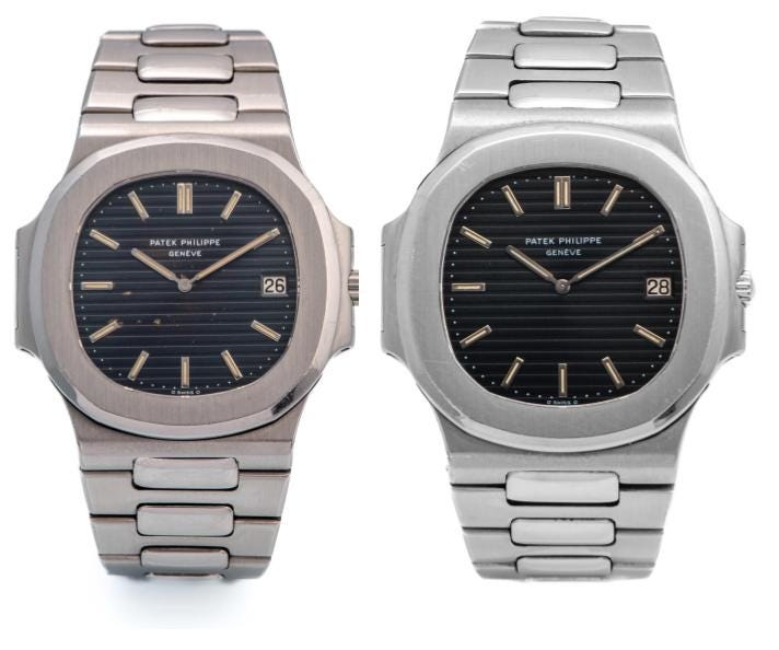
That result puts the modern reference right between two vintage Nautilus 3700 results from Antiquorum (photos above):
These two Nautilus 3700 examples are interesting to study together because their serial and movement numbers are both in an extremely tight range putting them towards the beginning of the 3700’s production in 1976.
These examples both have early “Type 1” dials, recognizable because of their dark blue “sigma” dials, with the Greek letter sigma below 6 o’clock. In the 70s, a handful of manufacturers (including, Patek, Rolex, and Vacheron) used this lower-case sigma to indicate the index markers and hands were made from white gold. These “Type 1” dials also have a few other defining characteristics, like that accent you’ll notice sitting on top of the “E” in Geneve.
💦 Go deeper: This forum post is an excellent deep-dive into Nautilus 3700 dials, illustrating the different types produced during the reference’s production run.
As for the actual results on these reference 3700s: They illustrate the huge delta between a dial that’s in pretty good condition (see lot 172), and one with some damage on it (see lot 140).
CUT FOR TIME
🌘 The Armoury x H. Moser ‘Total Eclipse’ is exactly the type of fun, classic and understated release you’d expect from the men’s haberdashery collab’ing with the Swiss brand that seems to have its tongue planted firmly in cheek more often than not. Vantablack dial, small seconds, 38mm limited to 28 pieces in both a steel and bi-colored steel/rose gold. It’s like a couple (really) cool kids got together to put their spin on a Patek Cataltrava ref. 5026.
AUCTIONS
This 'Racing' Omega Speedmaster just set a record for its reference. Here's why.
In last week’s Week in Watches, I featured a rare waterproof square Patek and a Tank Quadrilateral, similar to the one owned by Tyler, the Creator, both on sale last week at Antiquorum. Both out-performed their estimates, but I wanted to focus on the biggest out-performer of the auction, an Omega Speedmaster ref. 145.012-67 ‘Racing’ dial.
Antiquorum pegged its estimate at €20-40k, but the rare Racing Speedmaster zoomed past that, selling for €187,500. It’s a huge result for any Speedmaster, and — I believe — the biggest result we’ve ever seen for a ref. 145.012-67 without notable provenance. Typically, this reference is found with the familiar black Speedy dial.
So what is the Omega Speedmaster ref. 145.012-67 Racing?
In the 1960s, Omega produced a few Speedmasters with special hands, dials, and bezels that varied from the typically staid Speedmaster formula (black dial, black bezel, white hands). These include a few rare dial colors, the Ultraman, and today’s topic, Racing dial Speedmasters.
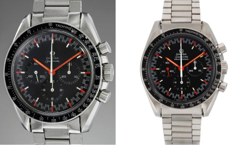
These Racing dials feature bold, contrasting colors on the outer track, generally thought to be designed to make the chronograph easier to read at a quick glance. Similarly, the hands are a bright red/orange, and most examples seem to feature a running seconds hand of the same color.
There are two generations of the Racing dial Speedmaster, making for a total of three different configurations:
Ref. 145.012-67: Red Racing Pre-Professional (first generation)
Ref. 145.012-67: Red Racing Professional (first generation)
Ref. 145.022: Orange Racing (second generation)
Ref. 145.012-67 Speedmaster ‘Red Racing’
According to Omega itself, it produced the ref. 145.012 Red Racing for a short time beginning in 1968.
There are two configurations of the first generation Red Racing, a Pre-Professional and Professional dial:
Red Racing Pre-Professional: These models are defined by the lack of the word Professional under Speedmaster at 12 o’clock. They also feature an applied metal Omega logo and use an Omega font similar to that you might find on earlier Speedmaster references like the CK2915 (note the long “O” in Omega, for example).
Red Racing Professional: These models have the word Professional at 12 o’clock, a painted Omega logo, and use a font that’s the same as other 145.012 examples of the era. Further, note that this example has slightly smaller subdials as compared to the Pre-Professional Racing dial (and other Speedmasters).
The Red Racing was produced for an extremely limited time in 1968. The dial is bold and exotic, totally unlike anything else Omega was producing in its Speedmaster collection. Produced right at the end of the 1960s, it’s a hint of what’s to come for watches in the 70s: big, bold, colorful designs that are a break from the often-modest chronograph designs of the 1960s.
In total, it seems as though there are likely less than a dozen of each Red Racing configuration known to today’s market. These numbers make it one of the rarest vintage Speedmasters around. Speedmaster resource book Moonwatch Only says there are about 8 of the Pre-Professional Racing dials and 5 of the Professional configuration.
In doing a bit of research, I found less than a dozen examples that have sold at auction in the past five years, plotting them on Instagram here. Auction results can be all over the place for this reference, extremely dependent on the condition and originality of the lot.
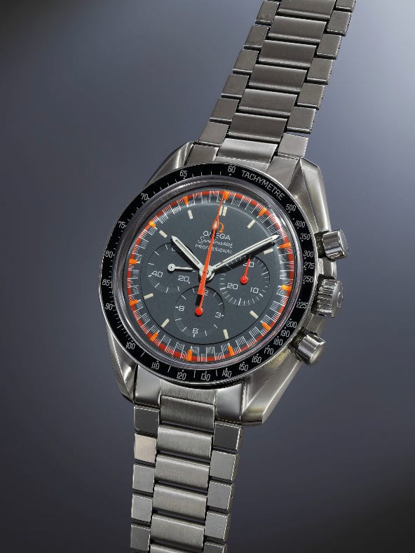
Speedmaster ref. 145.022 ‘Orange Racing’
Omega introduced the Speedmaster ref. 145.022 “Orange Racing” shortly after the Red Racing. With the updated reference the Orange Racing got a new movement, the caliber 861. Instead of red on the outer track, Omega used a bright orange paint. Additionally, the dial of the ref. 145.022 Racing is a sleek matte grey and not a true black like the Red Racing (or most other Speedmasters).
It’s thought that the Orange Racing was produced in slightly larger numbers than the Red Racing, but it’s still an extremely rare watch. The esteemed book Moonwatch Only cites less than 20 verified examples.
If the vintage Racing dials aren’t for you, in 2004 Omega produced a Japan Racing Edition (ref. 3570.40.00) limited to 2004 examples and inspired by the original Orange Racing.
Racing to the finish line
This isn’t the first time in the last few months a rare vintage Speedmaster has stolen the show. Everyone was caught by surprise when that tropical Speedmaster at Phillips Geneva sold for $3.1m back in November.
If anything, the result for this exotic Racing Speedmaster shows how strong the market is for legitimately rare vintage Speedmasters.
Personally, I love the result at Antiquorum. It’s not like Racing Speedmasters are true hype watches. Sure, any rare Speedmaster has a strong following, but the Racing Speedmaster is a real collector’s watch, almost an underground king. You have to know something about the Speedmaster to even know this thing exists, and then know even more to understand how rare it is and why this result isn’t totally crazy.
Beyond that, it’s just an awesome-looking watch.
🏎️ Go deeper on Omega Speedmaster ‘Racing’ dials.
TIMEKEEPING
This week we’ll get a ton of new releases from LVMH Watch Week and Oris’ release summit. I’ll try to hit the highlights in the next Week in Watches, and in the meantime I’ll also be sending out a watch spotting from my weekend at the Miami Beach Antique Show. Oh, and we’ve also got a Q&A coming from a call I did for questions over on IG. Reply to this email if there are any topics/questions you want me to hit! -Tony
Most Jellyfish examples are from later non-limited runs. Examples with “thin hands” are super-rare early examples. The photo of mine above has “thick hands.”






Didn't expect to see Brett Favre get roasted reading a watch newsletter LOL